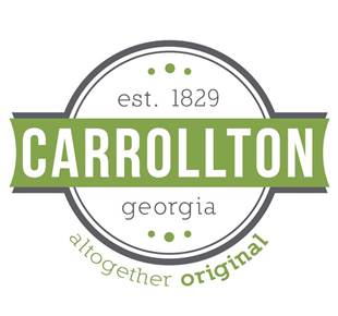
The City of Carrollton revealed the new City brand, “Altogether Original,” at this week’s Taste of Carrollton event.
The brand, which includes a set of logos, fonts, colors, and core messages, unified by an overarching look and feel, is built around Carrollton’s key strengths. These include a progressive mindset blended with respect for tradition, and an array of amenities not often found in a town Carrollton’s size. “Altogether Original” conveys the message that Carrollton is different from other towns its size and different from what people may think, but also the message that residents are highly individualistic yet united. The City logo projects a modern aesthetic, but also incorporates the year the City was established as well as hints of design elements seen on historic buildings around town. It clearly identifies Georgia so as to immediately differentiate the town from other Carrolltons across the country. The brand is intended to serve as a rallying point for locals and a way to communicate the City’s benefits to visitors and new residents.
This past spring, more than 50 people participated in focus groups aimed at identifying key City attributes, and more than 1,700 people participated in the subsequent opinion survey. Key words and phrases that arose during the research period included “unique,” “welcoming,” “different than expected,” “diverse,” and “modern.”
The reveal marked the official brand launch, and residents can expect to see City materials, signage, social media and other communications transition over the next weeks and months. The City will also begin a social media reveal of departmental logos beginning on October 16.
### PRESS RELEASE


